Illuminators employed a wide range of colourants, both man-made and naturally available. Organic pigments were derived from various sources, including plants, insects and molluscs. Inorganic ones were produced from minerals, earths and metals, including gold and silver.
Modern perceptions of colour are dominated by hue, but medieval and Renaissance artists and viewers were equally sensitive to its other aspects: texture, luminosity (brilliance) and intensity (saturation). To capture these effects and create a richer palette, illuminators juxtaposed, layered and mixed pigments. They experimented with new materials adopted from the glass, ceramic and textile industries.
Medieval and Renaissance viewers admired both the precious colourants and the craftsmanship that ensured their long-lasting beauty. Exotic rarity, long-distance trade, complex production and colour fastness increased the monetary and symbolic value of pigments. But the skill of the artists who applied them was equally important.
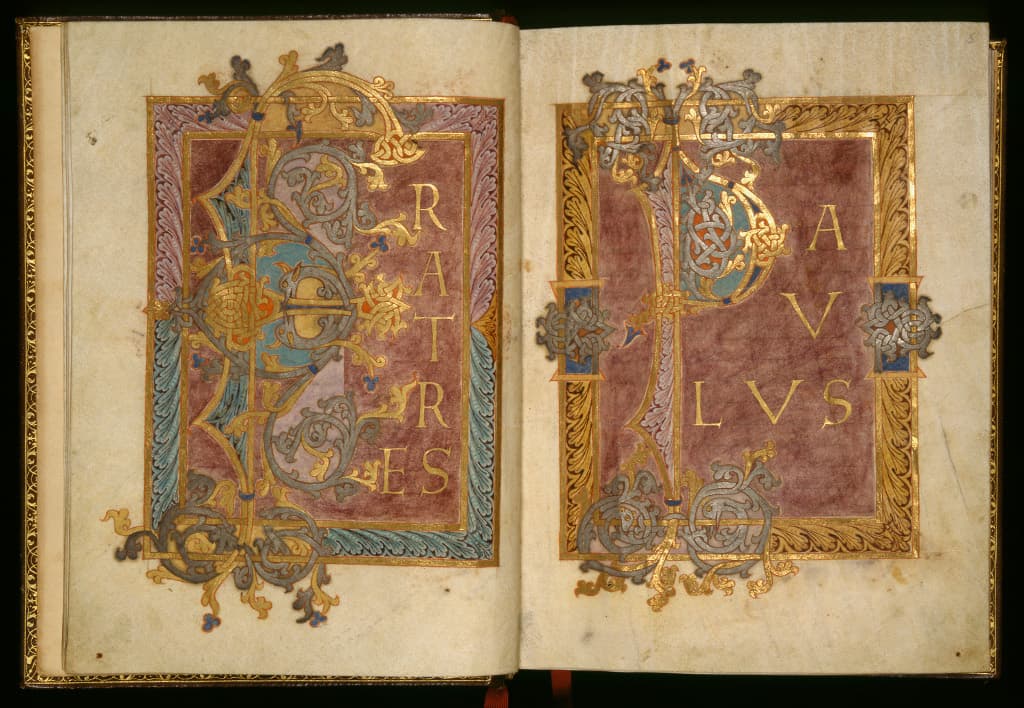
Christmas service in gold, silver and purple; Epistle Lectionary; West Frankish Kingdom, Reichenau, c.960-980 Artist: Eburnant (active in the late 10th century)
The harmony of gold, silver and purple characterises the finest 9th- and 10th-century manuscripts. They emulate volumes produced at the courts of the Roman and Byzantine Empires with costly materials, including the Tyrian purple extracted from mollusc shells. Here, the letters are real gold and silver leaf, but the purple is a cheap lichen extract. The orange is red lead, the turquoise azurite blue with lead white, but the dark blue details are priceless ultramarine. The range of naturally available and man-made, local and imported materials indicates the sophisticated tastes and technical skills available in 10th-century Reichenau.
Cat. 3 - Fitzwilliam Museum, MS McClean 30, fols. 2v-3r{: .display-5 .text-success }
Bequeathed by Frank McClean in 1904
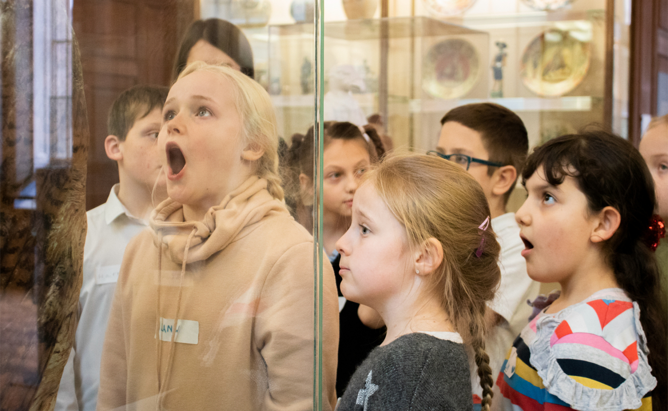
ILLUMINATED: Manuscripts in the Making
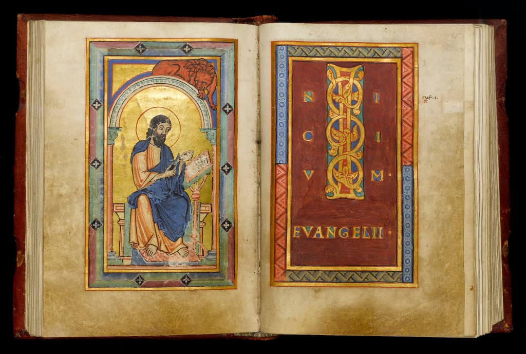
St Mark sharpening his pen
Gospels
Germany, Cologne, c.1160-1170
The gold letters and the purple page, painted with an organic dye, reflect the enduring fascination with imperial Roman and Byzantine manuscripts. But St Mark’s image displays colour combinations favoured in the 12th century: navy contrasting with orange-red and the harmony of green and pink. The palette, broader than in earlier centuries, includes carbon black, lead white, ultramarine blue, vermilion red, verdigris green, orpiment yellow and a pink dye. Equally adept at layering and mixing pigments, the artist explored both real and optical mixtures. He painted the green frames on the right by overlapping ultramarine and orpiment.
Cat. 4 - Fitzwilliam Museum, MS McClean 21, fols. 64v-65r
Bequeathed by Frank McClean in 1904
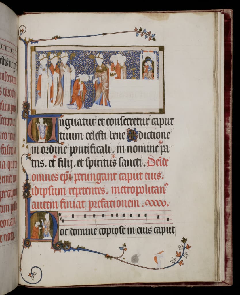
Anointing of a bishop; The Pontifical of Renaud de Bar; France, Metz or Verdun, 1303-1316; Artist: Master of the Cambridge Pontifical of Renaud de Bar
View the entry for this on Illuminated
This liturgical manuscript contains the texts of ceremonies, such as the dedication of churches or the blessing of kings, performed by bishops and popes. It was made for a Lorraine nobleman, Renaud de Bar, Bishop of Metz (1303-1316). The exceptionally talented, Paris-trained artist who is named after this manuscript, designed all 42 miniatures and the hundreds of initials and borders. The volume remained unfinished, revealing his working methods. The detailed drawings were covered in lead white, a smooth base that would increase the pigments’ luminosity. Then the gold leaf was applied, the azurite blue background painted and shell gold tendrils drawn over it. Next the drapery was painted in layers, starting with ultramarine, red lead, an insect-derived pink and a purple organic dye – a new material introduced towards the end of the volume. The base colours were shaded in ultramarine and organic glazes, and highlighted with lead white mixed into the main colourants. The sophisticated modelling, evoking the human form beneath the garments, and the experimentation with new materials reveal the artist’s technical skill and innovative spirit.
Cat. 6b - Fitzwilliam Museum, MS 298, fol. 123r
Given by Henry Yates Thompson in 1918
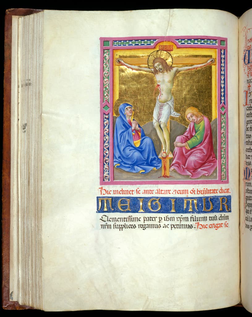
Crucifixion; Missal; Italy, Siena, c.1446-1450; Artist: Sano di Pietro (1405-1481)
This image, resembling a small devotional panel, was created by the celebrated Sienese easel painter and manuscript illuminator Sano di Pietro. The gold ground evokes Christ’s divinity and costly vermilion signals his sacrificial blood, but his human flesh is painted with humble materials: ochre, earth and lead white. Mary and John’s robes combine ultramarine blue, malachite green, insect-based organic pink, red earth and bright lead-tin yellow. This symphony of colours, typical of fifteenth-century painting and illumination, includes the juxtaposition of green and pink which was favoured from the 13th until the 17th century.
Cat. 7 - Fitzwilliam Museum, MS 6-1954, fol. 160v
Bequeathed by Viscount Lee of Fareham in 1947, received in 1954
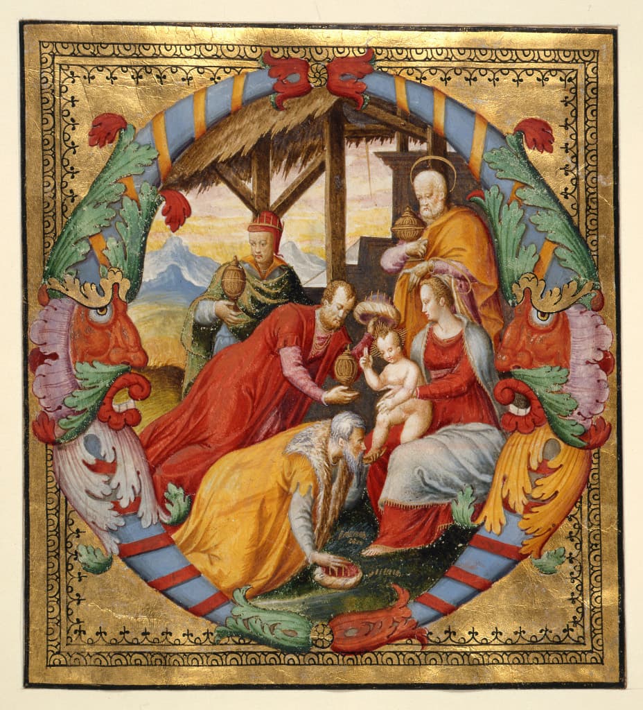
Adoration of the Magi; Initial O from an Antiphoner; Italy, Venice, c.1567-1572 ; Scribe: Venturino Veneziano (documented 1566-1572); Artist: Giovan Battista da Udine (documented 1567-1576)
This initial belonged to a set of Choir books made for the basilica of San Marco in Venice in the 1560s and 1570s. Its glowing palette represents the masterful handling of colour by members of Venice’s vibrant artistic community. The range of materials and complex mixtures is extraordinary: gold leaf, shell gold, lead white and chalk, vermilion, red lead, blue smalt, lead-tin yellow and pararealgar (an unusual yellow also found in Tintoretto’s paintings), organic dyes in pink and purple areas. The smalt, dyes and both yellows suggest close contacts between illuminators, painters, cloth dyers, glassmakers and ceramic artists.
Cat. 8 - Fitzwilliam Museum, Marlay cutting It. 40
Bequeathed by Charles Brinsley Marlay in 1912